
Hajimari: A Design System Case Study
Hearth is a fintech company building a platform that empowers home-improvement contractors.
Background
In 2021, Hearth was entering a growth phase. The team expanded quickly from one pod to three mostly autonomous pods.
Each pod took on ownership of existing features; but mainly, those new teammates were here to ✨BUILD SHINY NEW THINGS!✨
3x
Increase in pods
5x
Increase in engineers
This meant rethinking our existing practices—much of what made our small team successful wouldn't work as well for the new team structure. The big question was:
How might we effectively scale the way we build products?

Skip to Solution
Making the Case
Challenge #1:
Insight #0:
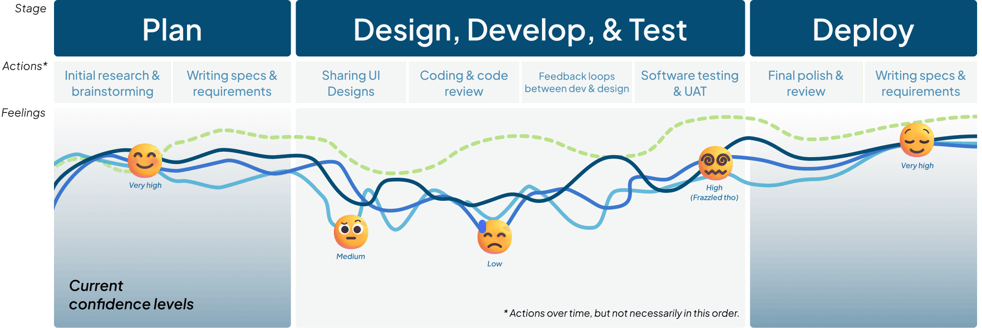
So what is this supposed to tell us?
This user journey diagram is an approximation of confidence over time regarding the launch of a feature, bug, or ticket they were working on. While the curves aren’t scientific or exact, they represent the average of sentiments I gathered from speaking with people 1:1, group retros, and Jira sprint metrics.
Challenge #2:
Insight #1
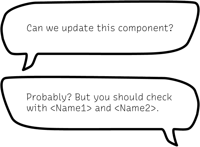
We lack clarity.
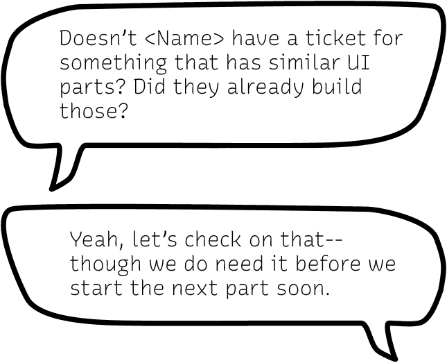
As a small team that works in a one pod, it’s relatively quick and easy to resolve confusion; it’s often just a message away.
But when you multiply headcount, you also tend to multiply the complexity and degrees of separation of conversations.
PMs, devs, and designers would go back and forth over meetings, messages, or comment threads (often a combination)
Insight #2
We're not consistent.
Engineers both new and old had experience upgrading libraries and integrating new technologies.
e.g., two pods would be trying to accomplish similar ends but the UX is different.
Insight #3
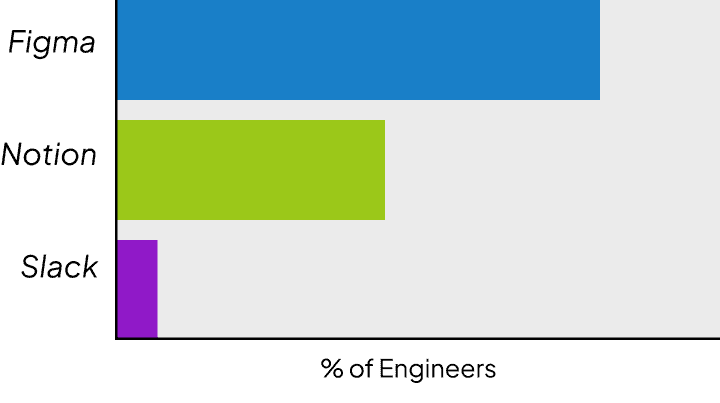
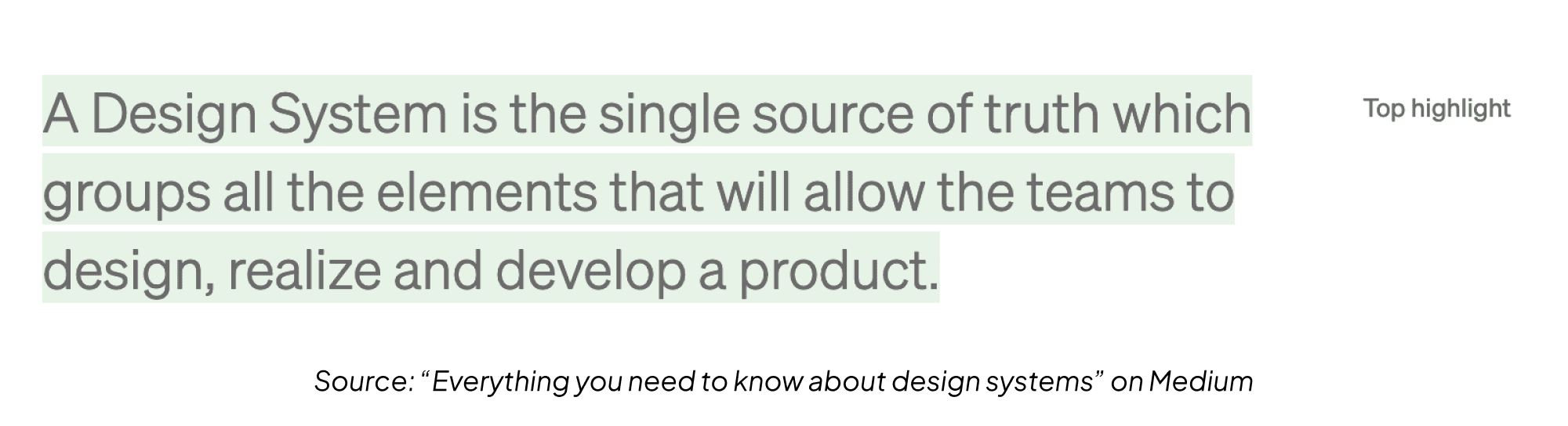
What's the source of truth?
This is really just an extension of the previous two points—the graph here represents an informal survey of responses to the question “What do you consider the source of truth?”
The unifying theme here is that there was ineffective communication. Each insight—or pain point—is distinct but also directly correlated with the others. For example, without a single source of truth, the highest possible level of consistency is lower by default.
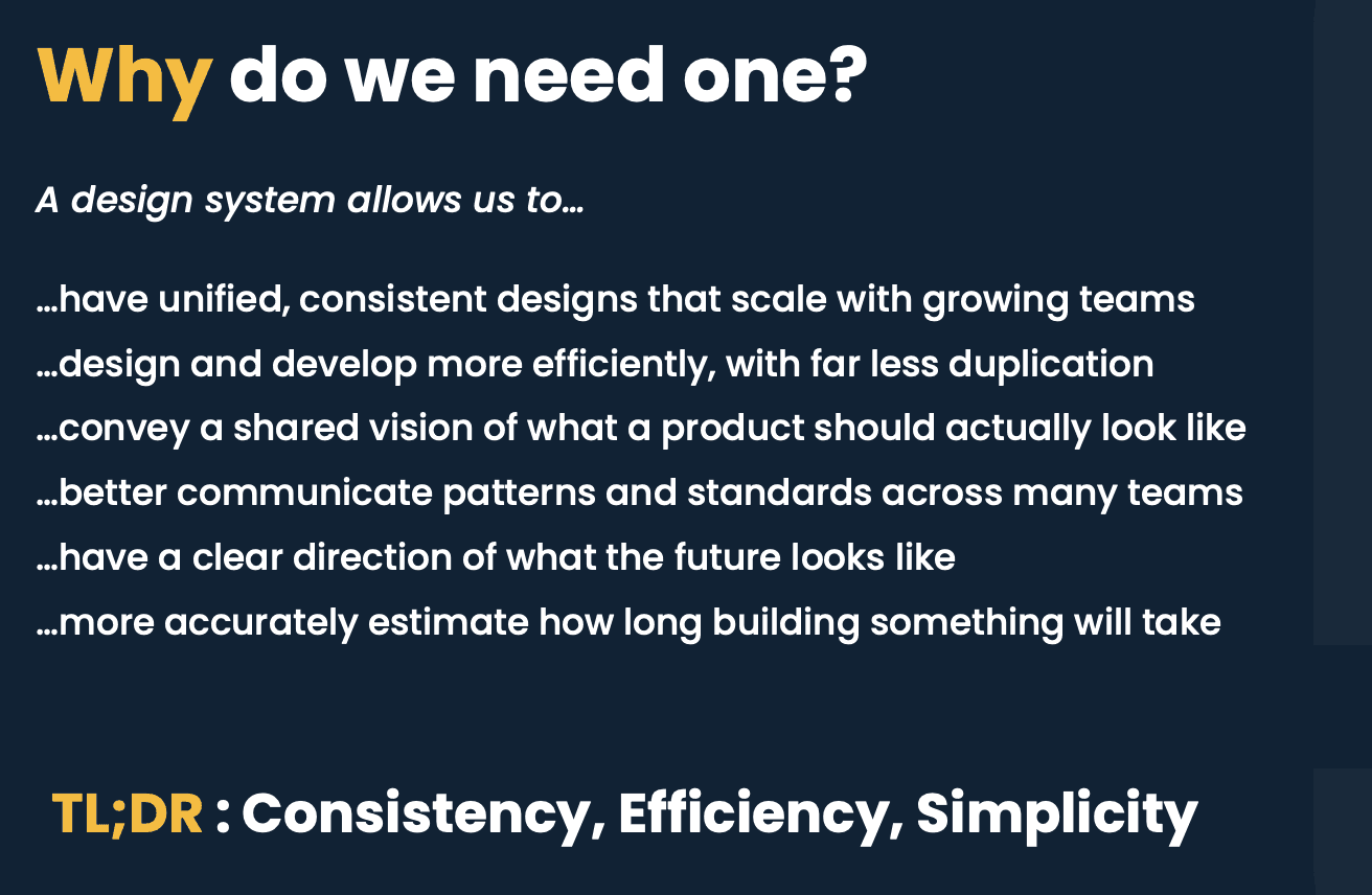
Wouldn’t it be helpful if we had a framework or shared language of some kind to address this?
NOTE: The overall problem here of scale and growth requires, by nature, a holistic approach. We, as both teams and individuals, made changes and additions across the board. An exhaustive list of those are not documented here, as this is a case study about the impact that, specifically, the design system had and the work that went into it.
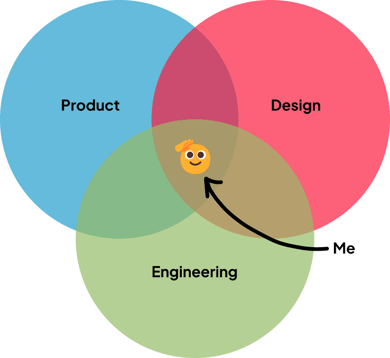
I had been interested in design systems as a concept for a while before Hearth’s growth spurt, and one of the new designers (Anastasia) happened to have experience building one in the past. This combined with the pain points defined above made for the perfect moment to pitch it to the team.
I had been interested in design systems as a concept for a while before Hearth’s growth spurt, and one of the new designers (Anastasia) happened to have experience building one in the past. This combined with the pain points defined above made for the perfect moment to pitch it to the team.
Slides from “pitch” presentation I made to the company

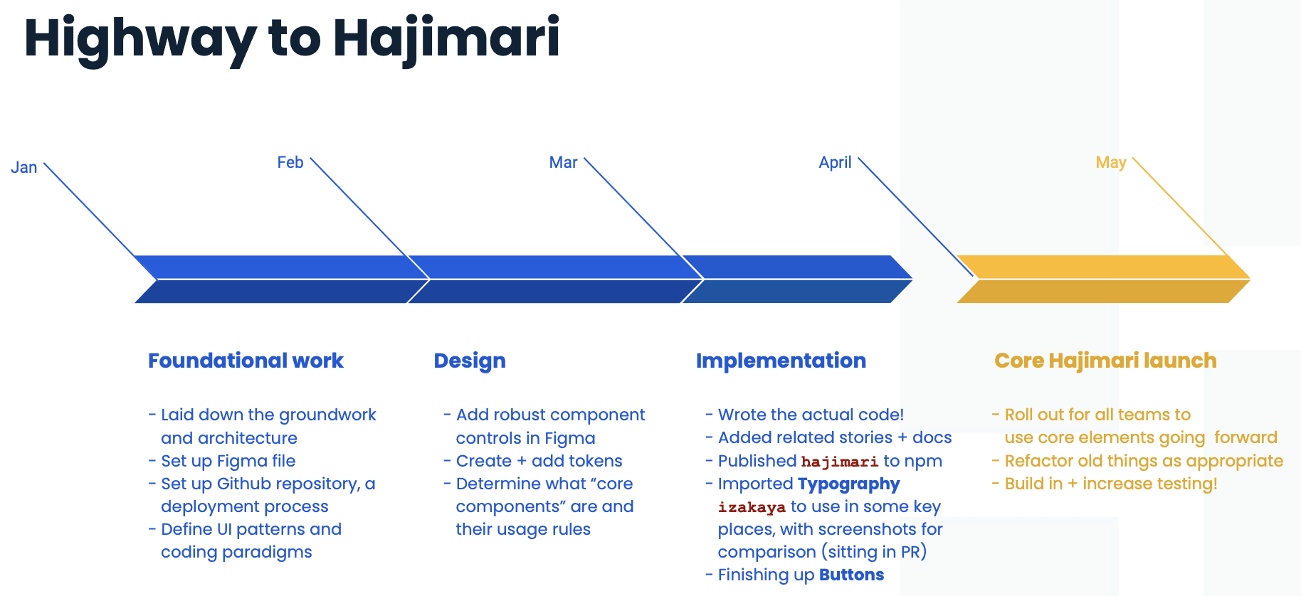
Introducing Hajimari
Part #0:
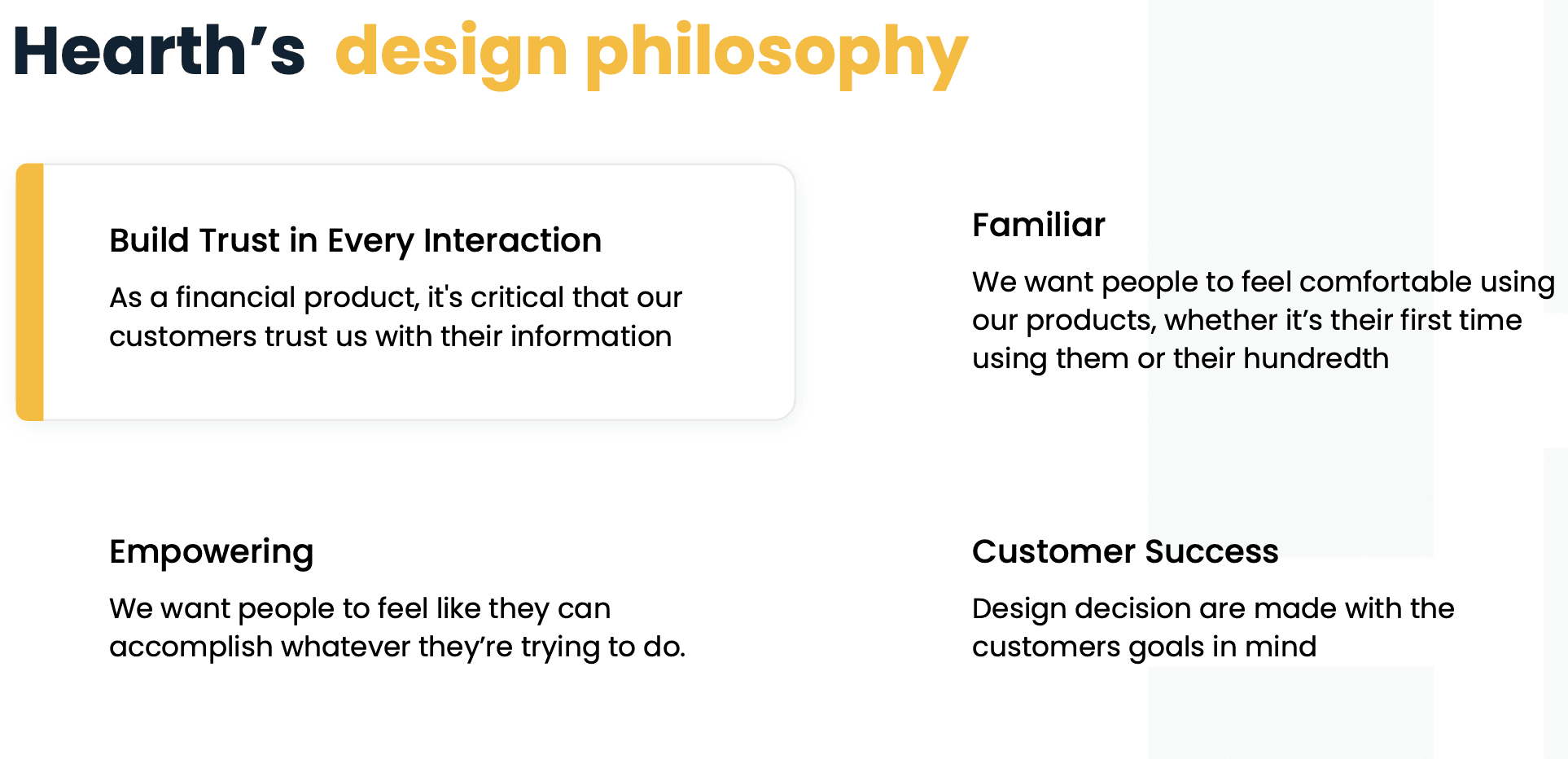
Design Philosophy
Like many well established design systems, we made sure to have a written-down design philosophy to carry forward as we expanded. Oh, and giving it a name: Hajimari.
In terms of "actual" design, we followed Atomic Design Principles to ensure scalability and modularity.
Part #1:
Design Tokens
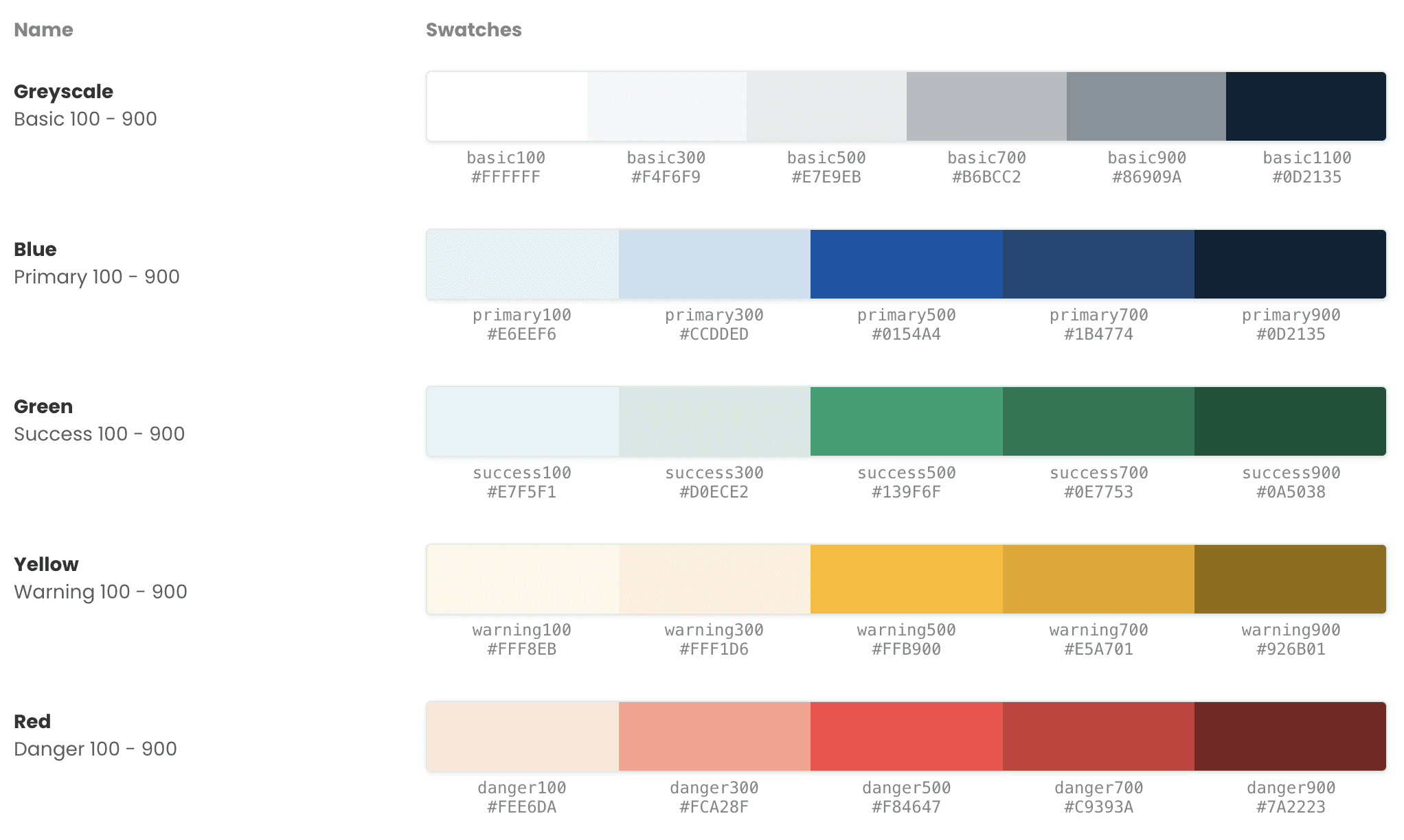
COLORS
For a while we had colors with "fun" custom names like fuego for a shade of red. This, of course, doesn't scale, and is confusing.
After that, we established a set range for each hue and used "blue500" or "red700" to select a specific shade.
Finally, we used naming conventions that many other design systems do (like MUI), and called colors by the names that made sense in context (see Buttons below).
TYPOGRAPHY
(DEPRECATED) TYPOGRAPHY
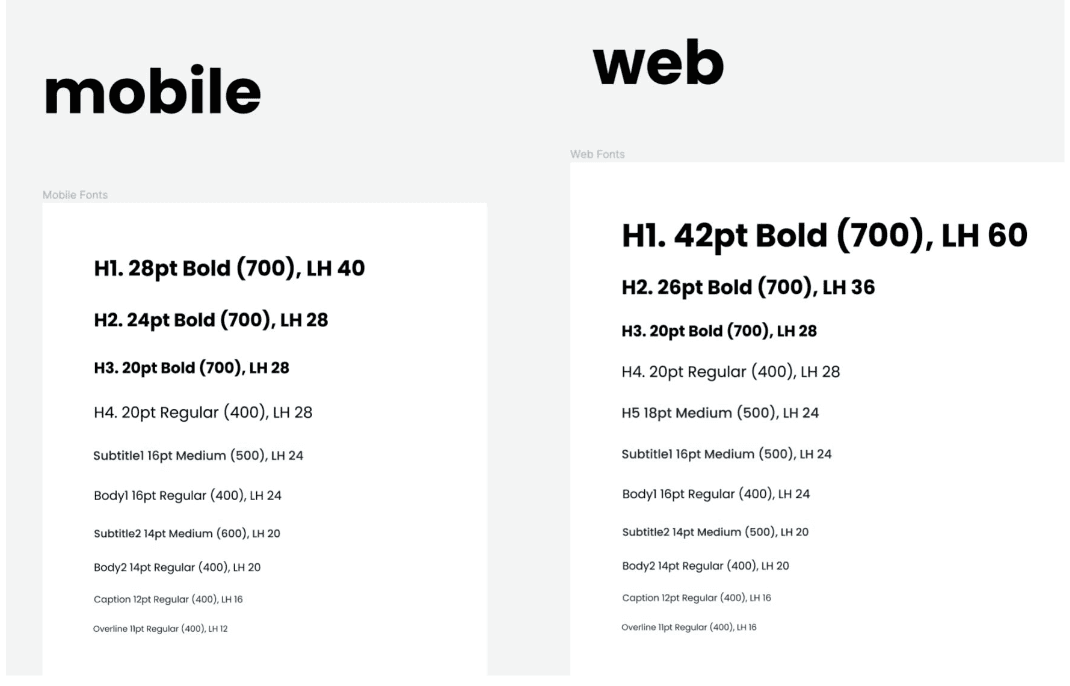
In days of old, typography was a mostly a set of loosely defined CSS that were a direct mirror of the defaults provided by MUI.
Because there were so many options and no truly set guidelines, if a design “needed” a smaller caption than we usually used, the end result was often “just add custom styling to make it bit tinier and bolder.”
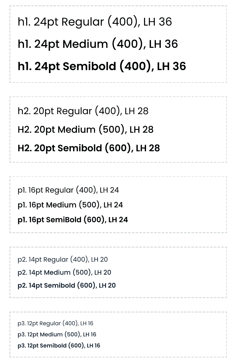
(UPDATED) TYPOGRAPHY
Both Figma and the codebase got “messy” real fast.
We stepped back to see that we needed to (1) select only some sizes that made sense for the product and (2) limit the weight options to just three.
By making these fixed, we were free to “mix and match” as needed, while keeping things clean, consistent, and reusable across mobile and web.
Part #2:
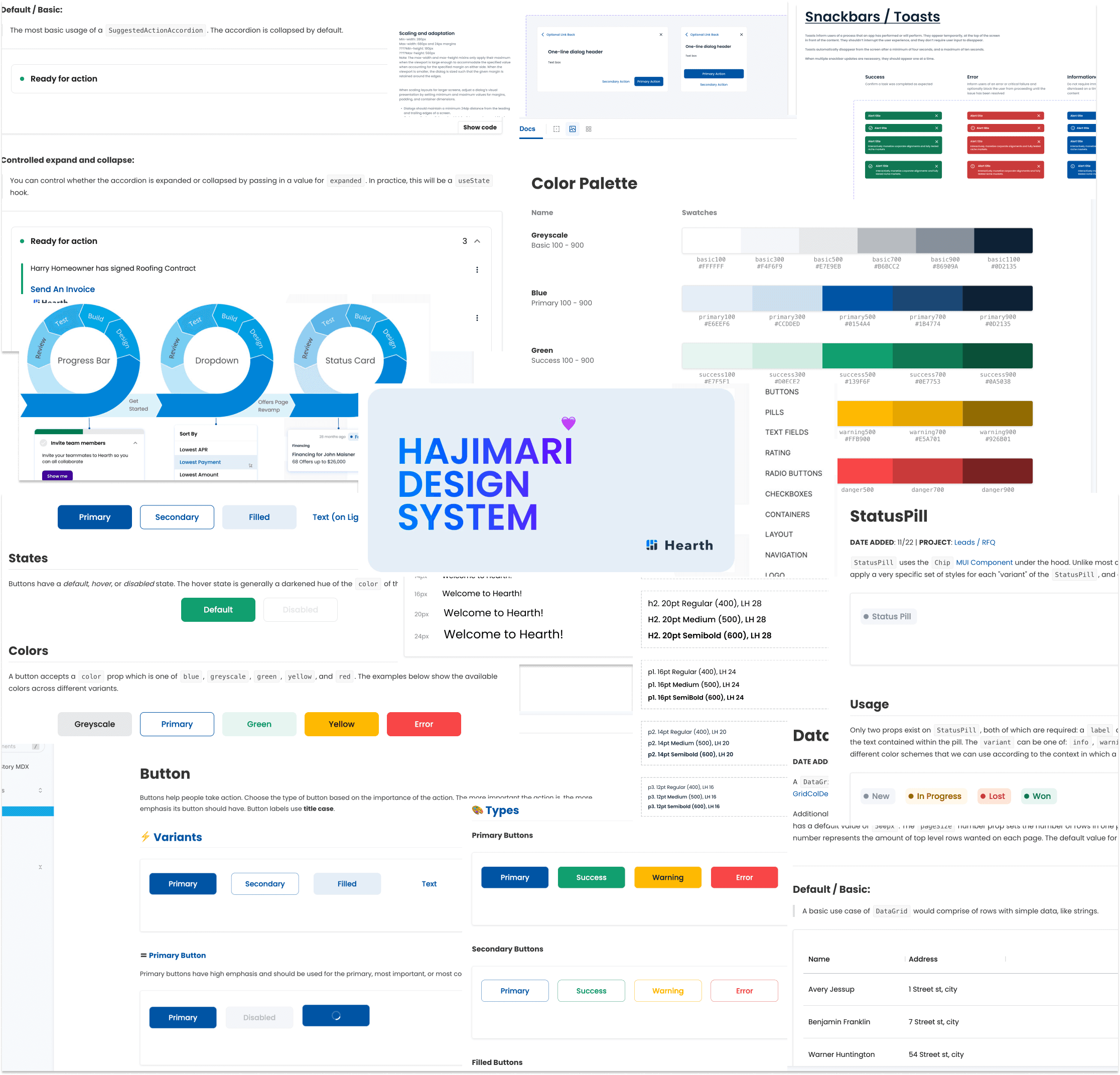
Components
The challenge here was actually designing the API--that is, how these components could be customized in code--to be compatible between the Figma notations and best dev practices. Not to mention pulling names from the base library--we had to answer questions like “well, calling this button style ‘secondary’ makes a lot of sense for us here, even though MUI uses it differently.”
The following is a selection of some key components; there were many more added over time.
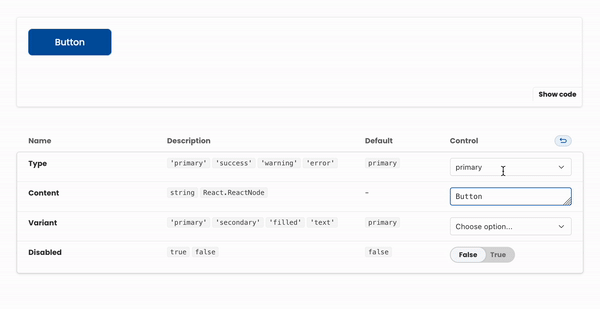
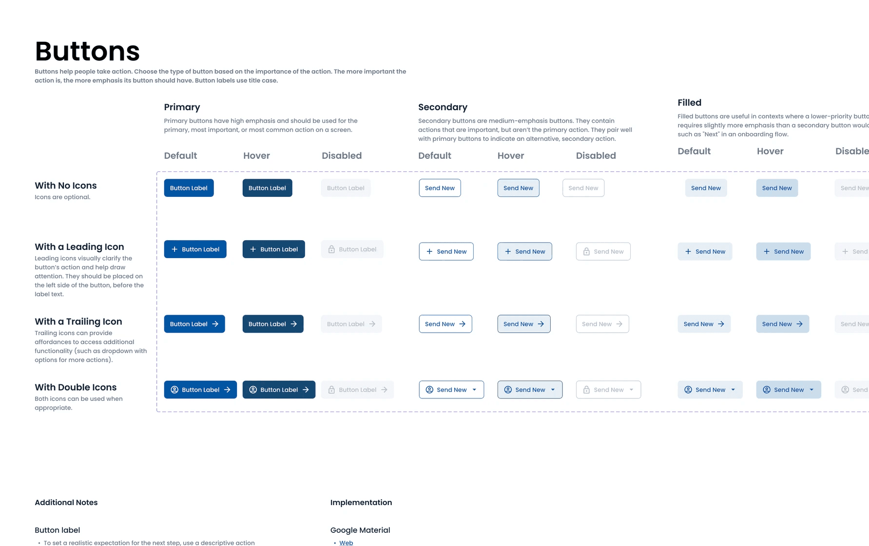
BUTTONS
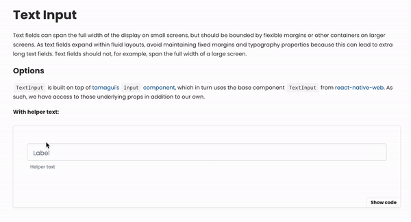
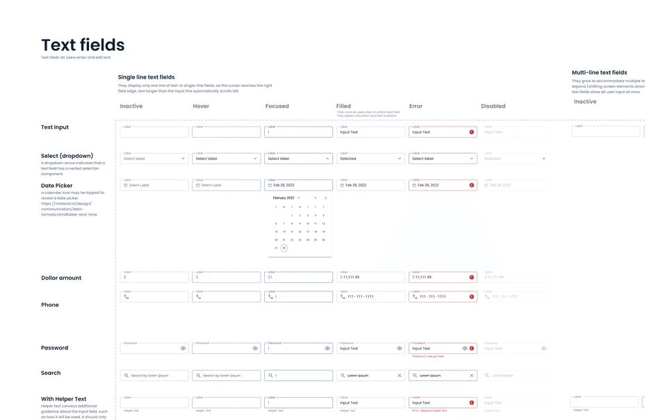
INPUT FIELDS
Given that the product was mainly forms, input fields were important to get correct. In particular, a consistent experience across field states (e.g. error, active) ensured that users got useful feedback and knew exactly what was expected of them.
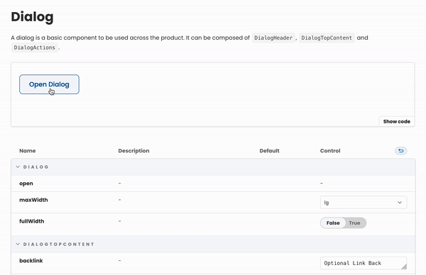
DIALOGS
Before this component came along, we didn't have consistent answers to "where should these buttons go?" or "what about the title and actions?" and the styles were just ever so slightly different.
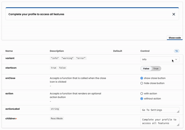
INLINE NOTIFICATIONS
An example of a more specific, customizable component. We would often need to make in-app announcements for different purposes; before this it was very ad-hoc and an inconsistent UX for the user.
Part #3:
Governance
At a tactical level, we had to figure out the order in which things happen, when they happen, and how often they happen. It seems obvious and unnecessary to explicitly define--but, as we saw earlier, there needs to be a “source of truth.” There needs to be a process.
At each stage, we made sure to answer the right questions:
DESIGN
What components can we reuse or tweak?
Is this a scalable change?
Where else might we use this in the future?
DEVELOP
Would it be more effective to add to the component library or make a one-off?
What kind constraints vs freedoms should we have?
What should things be named?!
DEPLOY
What other features does this change affect?
Do we need to release a new version of Hajimari?
Results
❤️ CONSISTENT UX
With a cross-platform design system, engineers and designers were able to ensure that user flows and experiences were the same between both web and mobile, decreasing user frustration and increasing trust.
💡 DOCUMENTATION
Accessible, "living," and actively maintained documentation was established across platforms used by the whole team.
It made onboarding much smoother, and reduced overall friction during the development lifecycle.


🚀 FASTER TO LAUNCH
We spent less time tweaking components to fit certain features, going back and forth, and had increasingly well defined building blocks.
The cross-platform design system in conjunction with the rollout of "universal app" for the product allowed us to work on mobile and web features at the same time.
50%
Decrease in dev time
2x
Feature launches